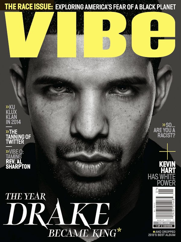
The masthead is very clear. The bright yellow colour that is used on the font contrasts very well with the grey scale background and because of this we can read it well. The font used is all bold, and the masthead is very predominant on the page, allowing us to recognise this as the title of the magazine.
The cover picture is centred. This is unusual in magazines as photographer often use the rule of thirds when taking pictures, however it is a common theme in VIBE magazine that the model in the picture is dead centre. This attracts the audience directly to them. The Artist in the picture also uses a direct mode of address so that when you are drawn to him he almost 'looks you in the eye' creating somewhat of a 'relationship' with the reader. The coverlines are aligned right and left according to which side of the page they lie on, this is to keep the middle of the magazine free so not to draw attention away from the direct gaze of the cover model.
The plus sign is often used as a semiotic because people often look at a plus sign and think, positive, or more, a higher value. If there is more inside, then the audience is attracted by the use of this symbol and will buy the magazine.
Only one picture is used on the contents page to stop any over crowding of the page due to the magazine being heavily text rather than pictures. The picture is in grey scale with a bright red heart to make it stand out. The model/s have made it look as if the heart is being grabbed by a woman's hand. This is to tell a clear story of the image.
Behind the image is a large V, the same font as the masthead, giving the contents a link to the front cover and having a house style throughout. Something very commonly used in VIBE magazine is the way in which they split the word 'CONTENTS' into 3 different lines. It gives it a 'jagged' look and also connotates to what hip hop is all about. It is about going against regular things in society and by not having the word in uniform they are conveying this convention. Written in a very small font on the picture is the picture credit, notifying the reader who is responsible for the photography so that they know the photographer and stylist for the photoshoot for this picture in the magazine. It is meant to take up minimal space on the magazine and is therefore written in a very small font size in order to not take attention away from the image itself.
The photos on this double page spread are similar to those of that I have already analysed. They take up only one section of the page and are not placed right in the middle, for example. This is a good use of the page furniture by VIBE because as I mentioned earlier, it is very text heavy, and by having the photographs to one side of the page allows them to maximise the amount of space they need for the body copy.
The standfirst is used well here, it is a small paragraph that allows us to get an idea of what the article is about before going into the body copy. The body copy in this double page spread I would say was around 1000 words in a size font between 8-10. Very commonly in magazines you will notice that the first letter of the first paragraph in the article will be maybe 3 lines big. This is known as a drop capital and just lets the reader know where to start reading from which is why VIBE have used one.
For some reason, VIBE magazine choose to ignore the rule of thirds in their photographs. They very often centre their artists and because I have seen this a lot in my research I will look to also ignoring the rule of thirds in my final production.


No comments:
Post a Comment